A nonprofit event site connecting Guardian 4 Heroes and Heroes K9 Odyssey Academy — built to communicate mission, drive registrations, and handle event logistics. It's live now and gaining real traction.
The Problem
A high-impact nonprofit event needed a digital home that conveyed urgency and purpose while staying simple enough for visitors to register fast.
The Build
A multi-page, hand-coded site with event info, schedule, registration, and a backend admin view — deployed clean on GitHub Pages with zero framework overhead.
The Result
A live site getting attention right now, with a digital presence that finally matches the weight of the mission behind it.
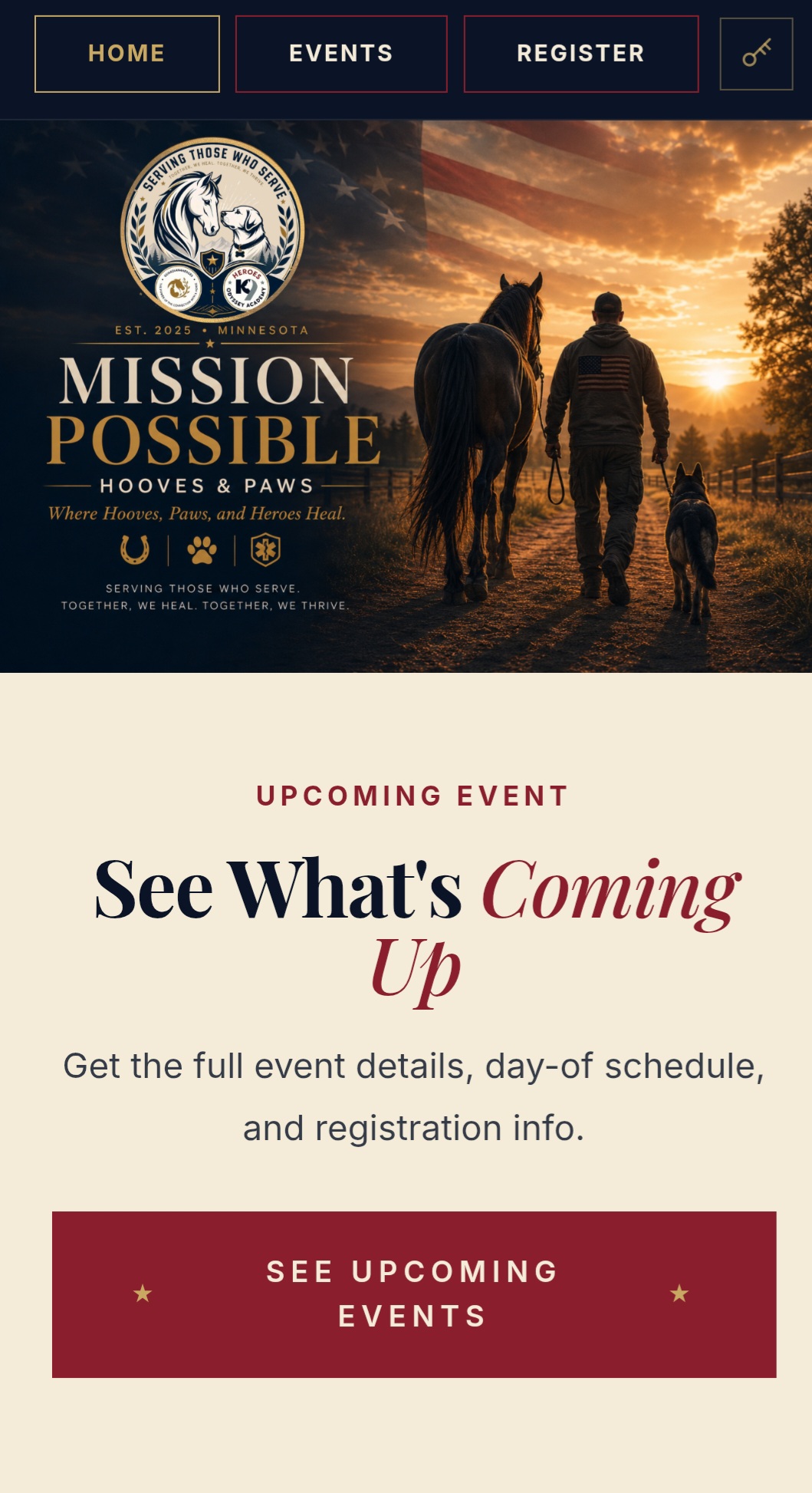
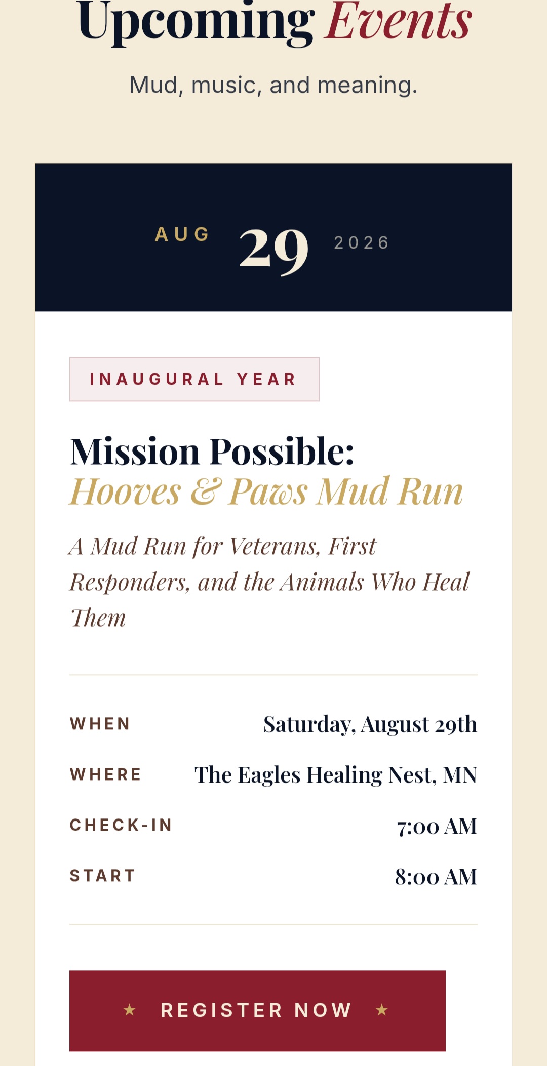
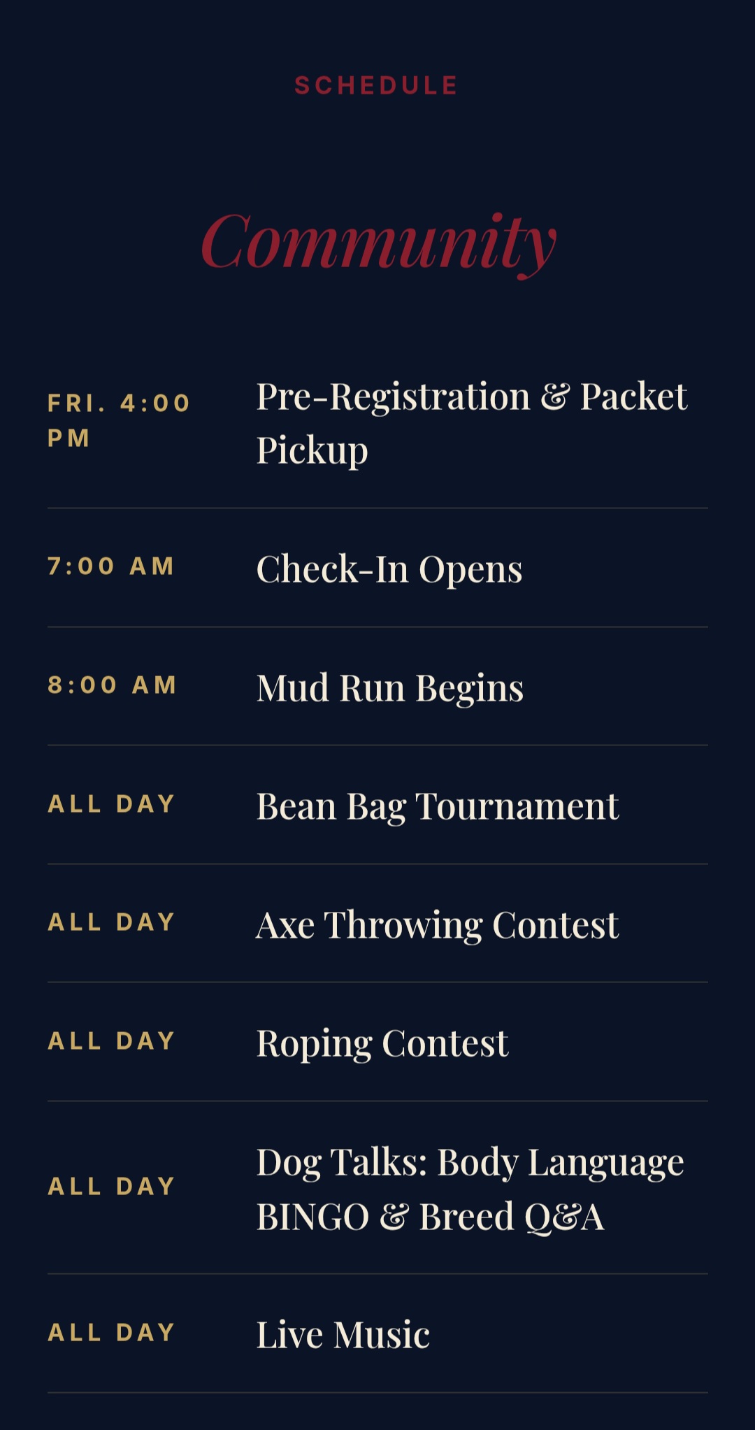
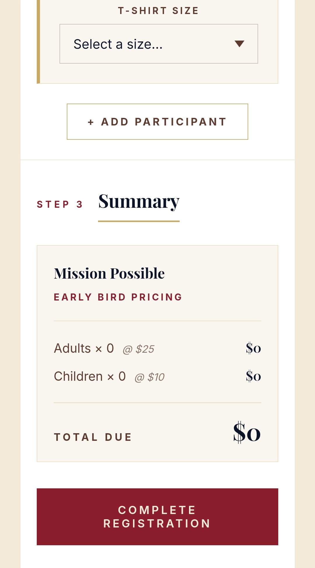
A.01Events page — schedule and details for the day's activities.A.02Registration flow — clean, mobile-first sign-up path.A.03Backend view — admin capability for managing the event.
02 — Live Site
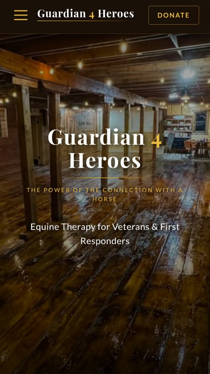
Guardian 4 Heroes
Live SiteMulti-PageEquine Therapy NonprofitHTML · CSS · JSGitHub Pages
An equine therapy nonprofit serving U.S. veterans. They came in with a mission and a name — and no web presence. The result is the emotional credibility anchor of this whole portfolio.
The Problem
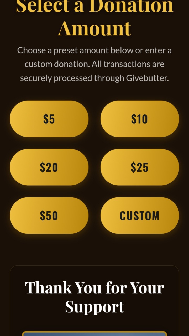
No website at all. The organization needed something that conveyed the emotional weight of their work while staying trustworthy enough to attract donors and participants.
The Build
A photography-forward, fully custom site with clear program information and a donation pathway — responsive, fast, and built to reflect the dignity of the mission.
The Result
Consistent compliments and increased program inquiries since launch. It brought their mission to life.
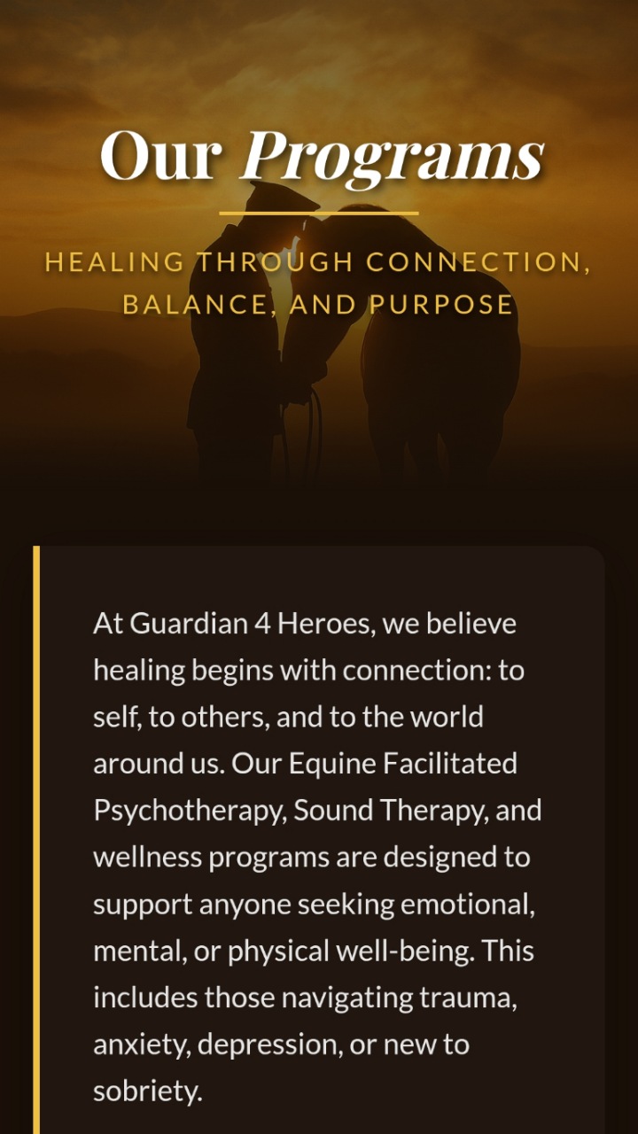
B.01About section — telling the organization's story.B.02Programs — outlining the therapy services offered.B.03Gallery — photography-forward storytelling.
"
Craig went above and beyond. He didn't just build us a website — he brought our mission to life. We get compliments on it constantly.
Guardian 4 Heroes Team
Demo Builds
03 — Demo
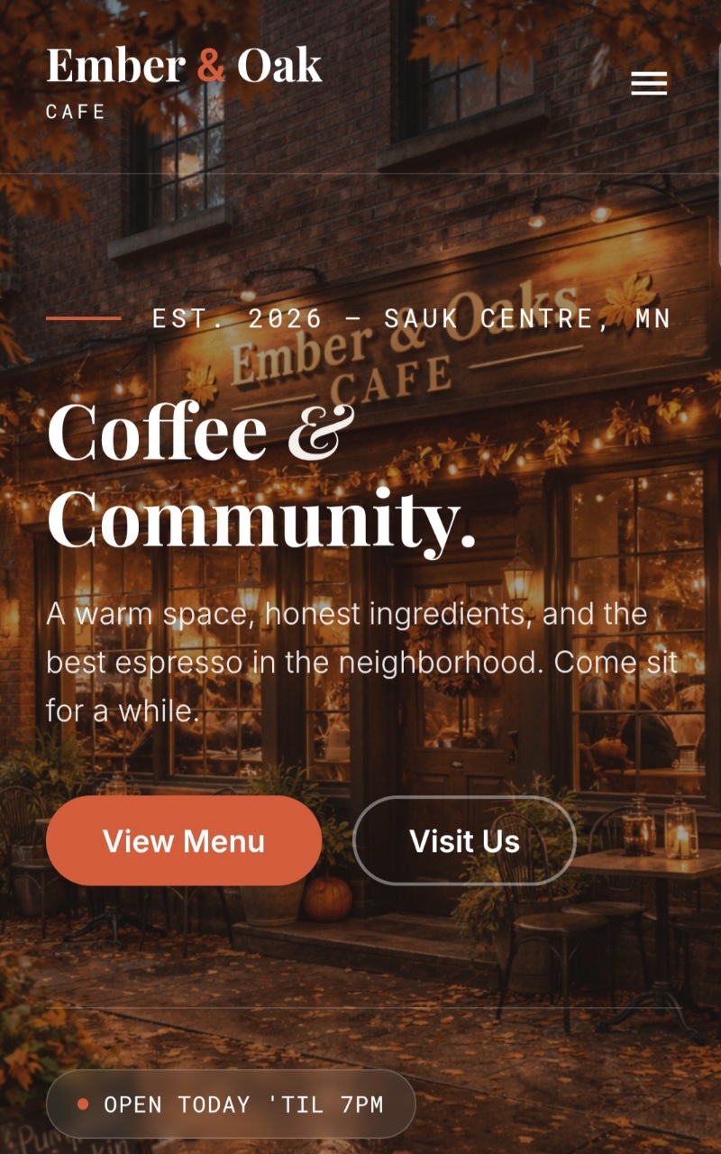
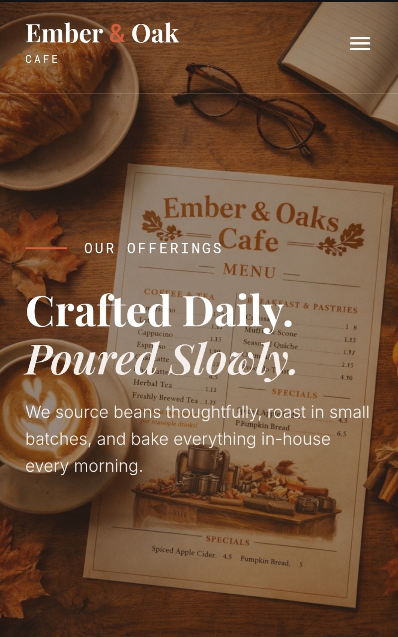
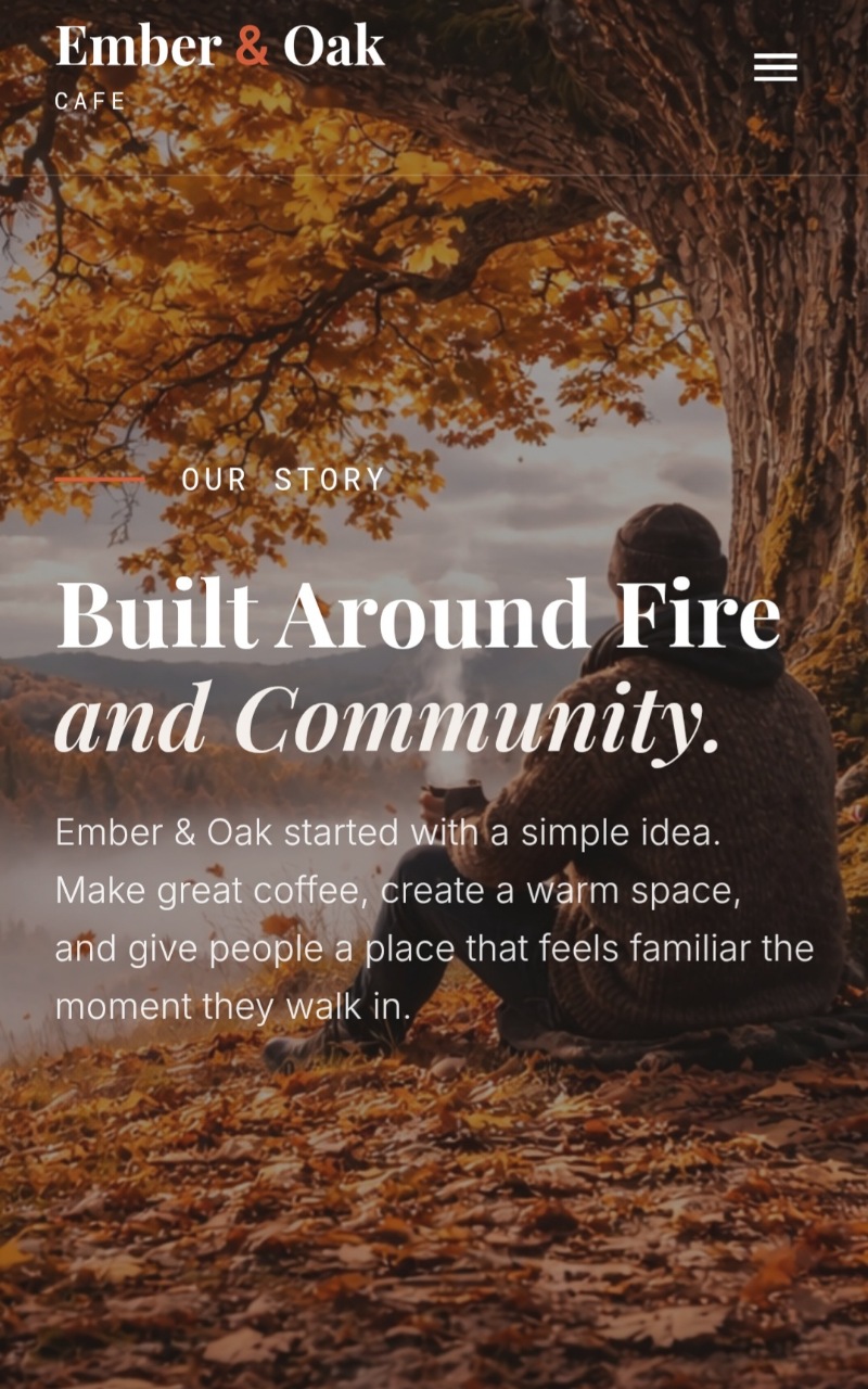
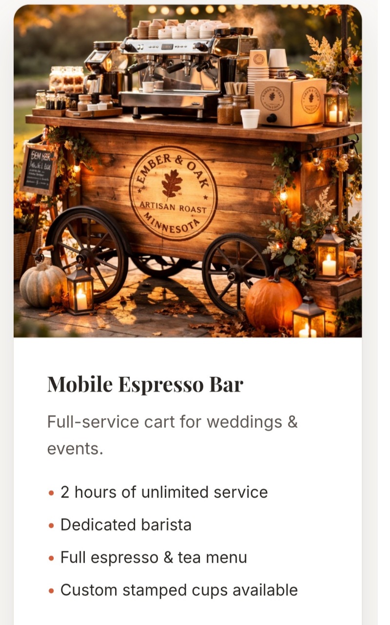
Ember & Oak Cafe
DemoMulti-PageRestaurantMobile Menu OverlayHTML · CSS · JS
A dark espresso-themed restaurant site — premium without being pretentious. Full-screen mobile menu overlay, multi-page structure, and a visual identity that feels like the neighborhood cafe it represents.
C.01Menu page — full food and drink listing.C.02About page — the cafe's story and atmosphere.C.03Catering — service details and inquiry path.
04 — Demo
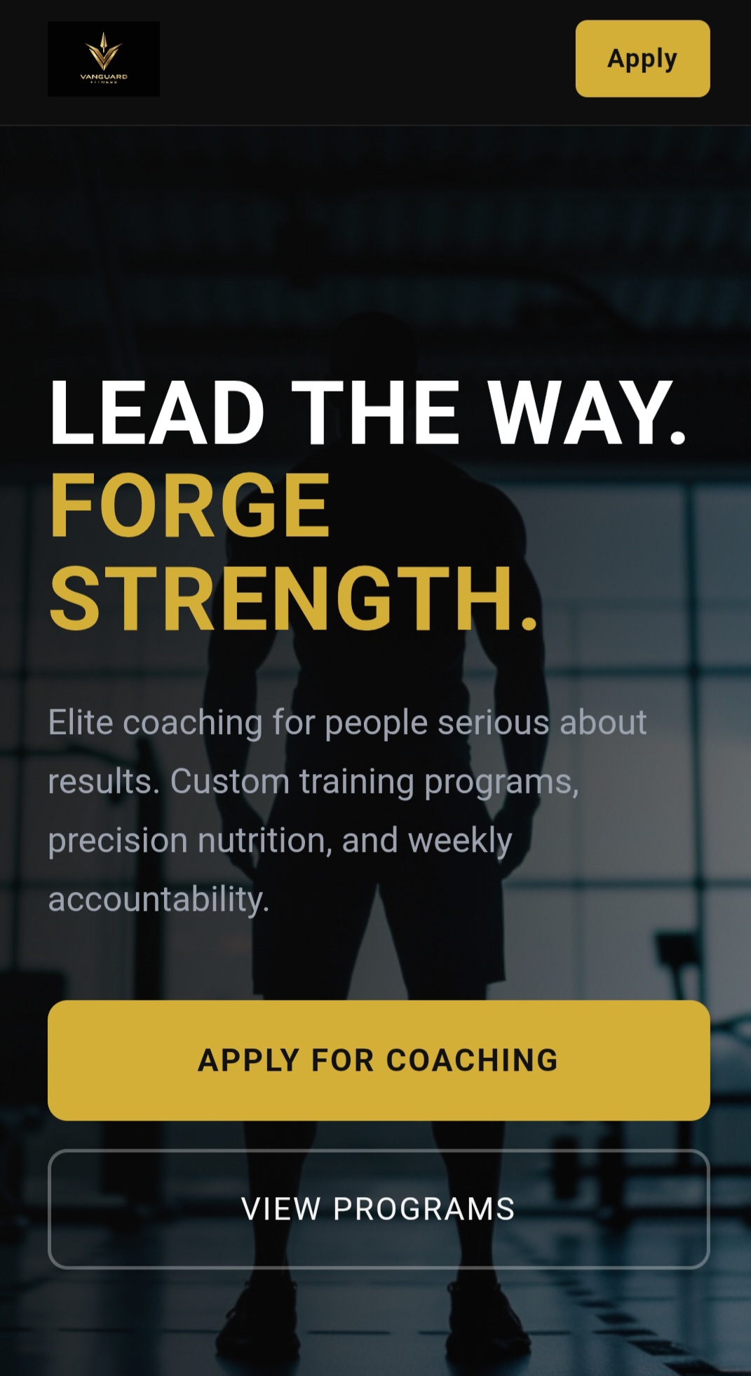
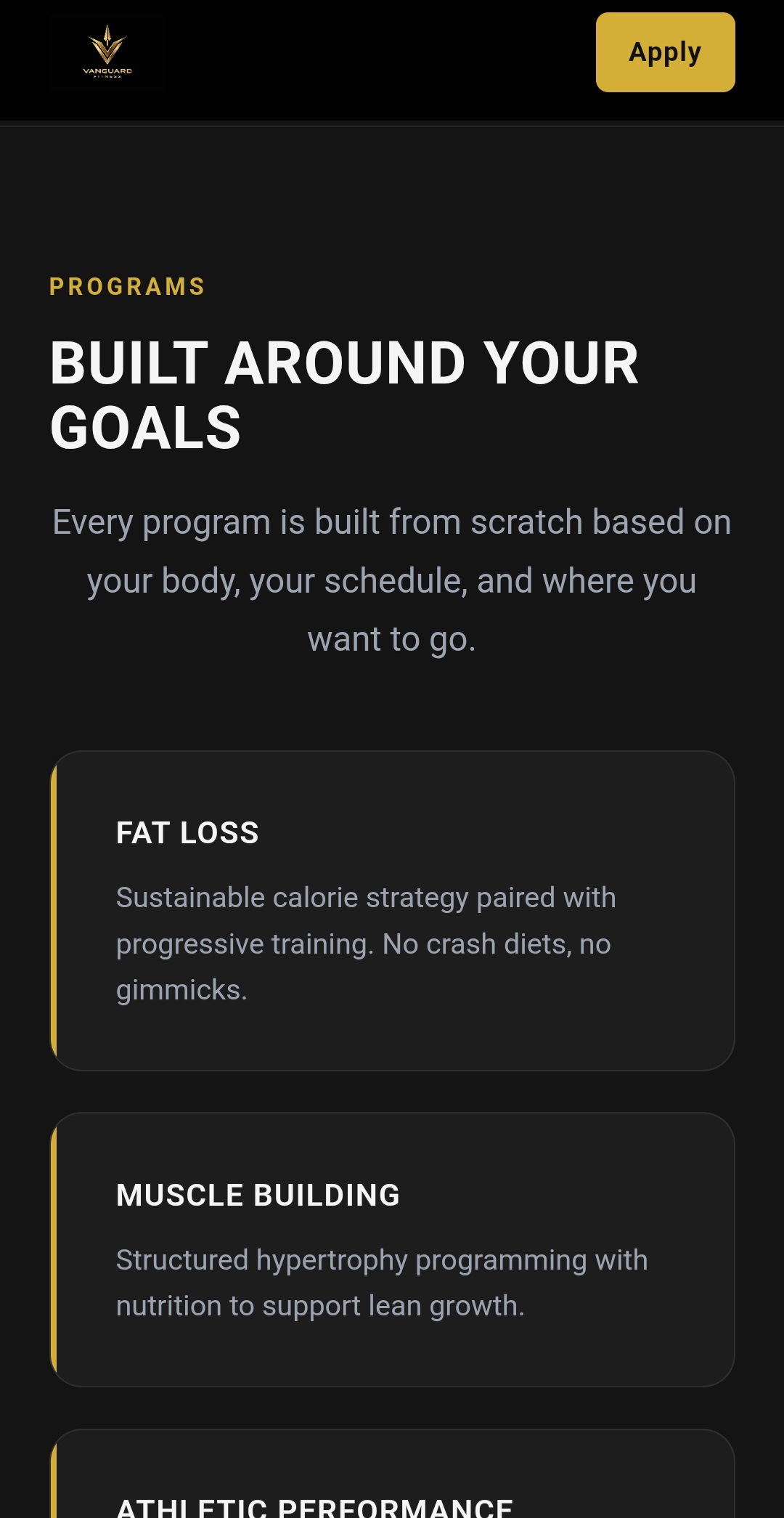
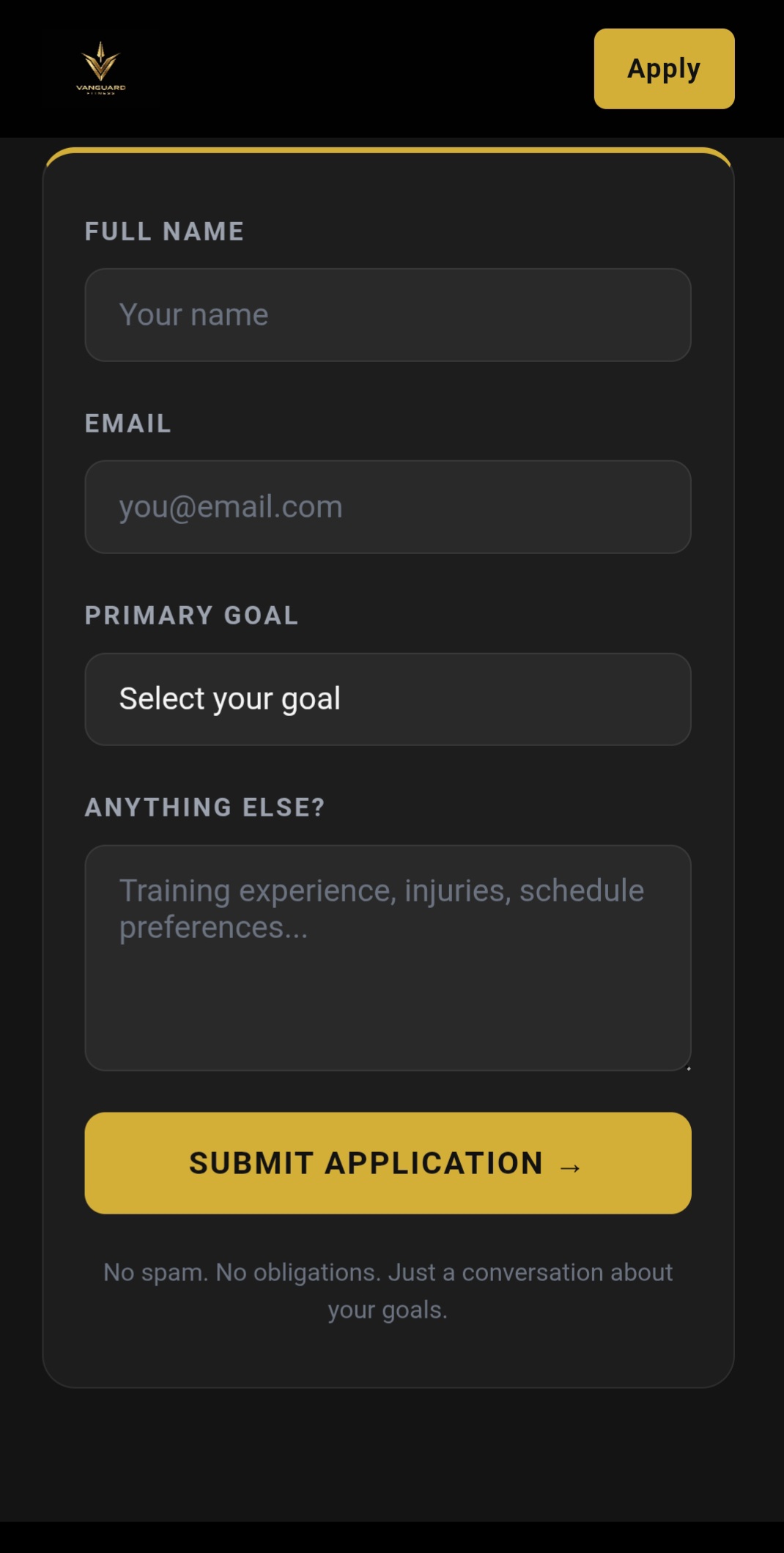
Vanguard Fitness
DemoCoach FunnelLead GenerationHTML · CSS
A fitness coach landing funnel built to convert — bold visual identity, program breakdown, social proof, and a strong call to action for a coach who takes their brand seriously.
D.01Program section — structured training breakdown.D.02Conversion section — strong, focused call to action.
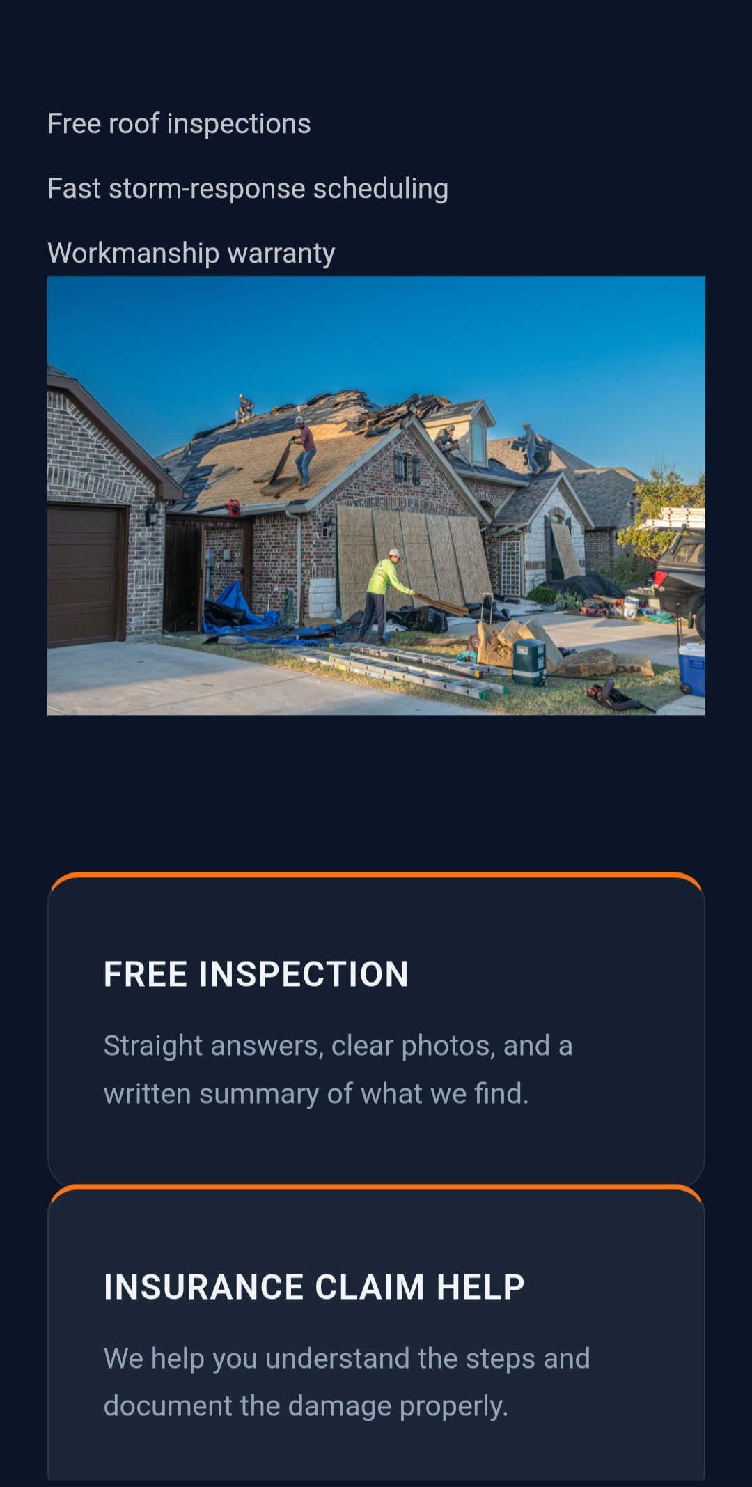
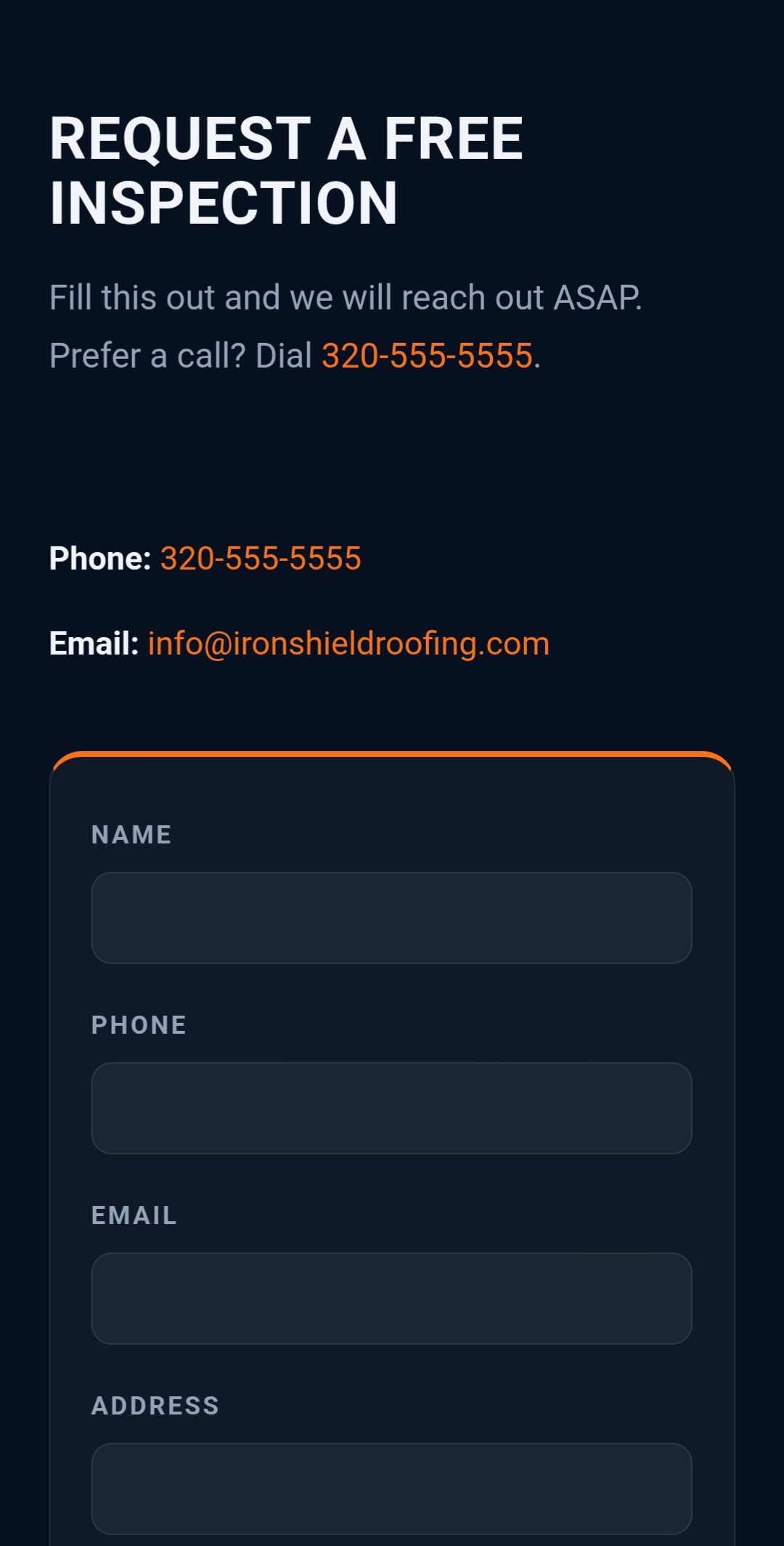
A single-page lead generation site for a local roofing contractor. One goal: turn visitors into phone calls. Bold hero, clear services, trust signals, and a single prominent call to action.
E.01Services — clear breakdown of offerings.E.02Contact — single prominent conversion path.
06 — Landing Page
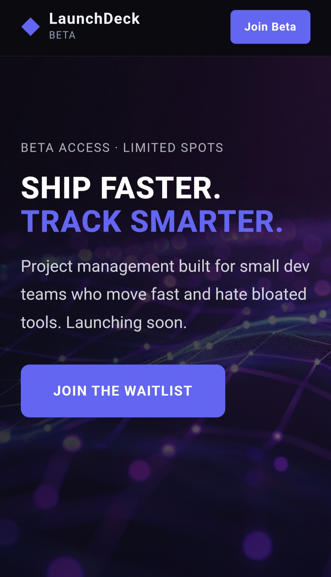
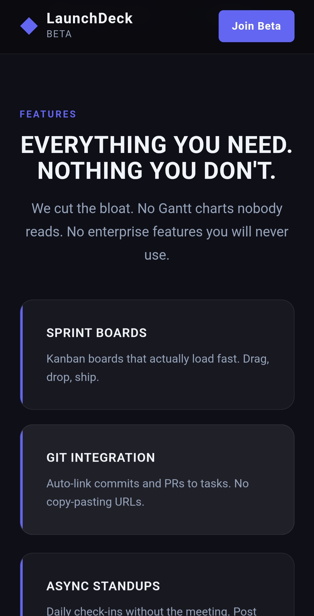
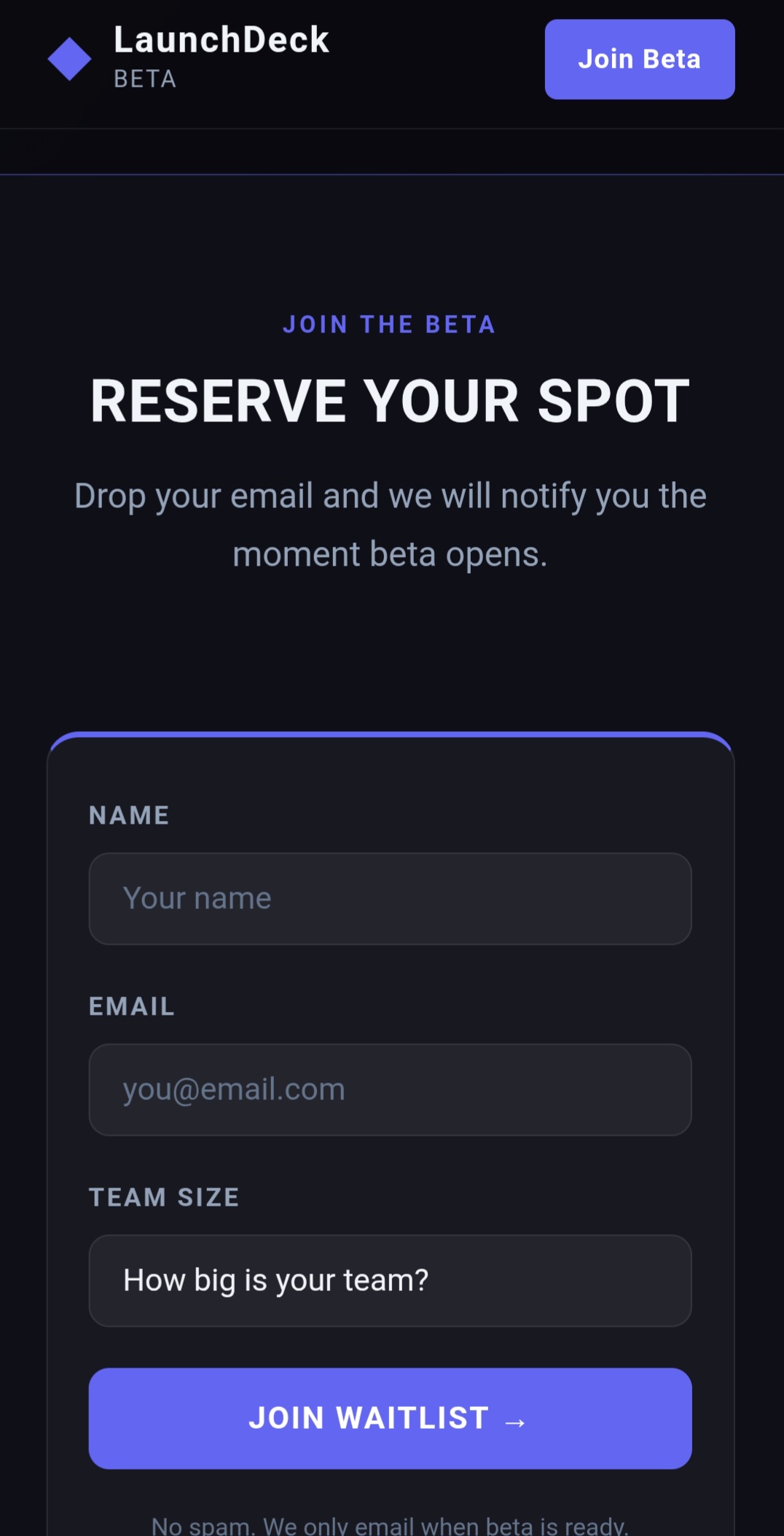
LaunchDeck
DemoSingle PageSaaS WaitlistEmail Capture
A pre-launch waitlist page for a SaaS product. Build anticipation, communicate the product's value, and capture early sign-ups before launch. Dark, futuristic, conversion-focused.
F.01Features — product value at a glance.F.02Waitlist — early-access email capture.
On the Horizon
What's Next
In Progress
More Live Clients
Actively taking on new small business and nonprofit builds to grow the live-client roster.
Building
Digital Products
Sellable templates and resources — premium, problem-solving, and built to the same standard.
Goal
Lighthouse 85+
Continued performance, accessibility, and SEO optimization across every page.